The Story of the 1970s Football Helmet Logo is Now Part of Mountaineer Lore
John Antonik
MORGANTOWN, W.Va. – Among the many things that Wren Baker has managed to accomplish here since his arrival nearly three years ago was the development of a true throwback football uniform.
And while that’s way down on the list of his accomplishments to date, the reintroduction of the 1965 football uniform worn in the Utah game last month proved to be overwhelmingly popular with Mountaineer fans and extremely profitable for the athletic department.
It stirred lots of discussion about the history of those uniforms - some accurate, and some not so accurate. Of course, that’s to be expected when you are tracking down the history of something that happened 60 years ago and was not widely reported.
Unlike today, nobody really cared too much about uniforms back then.
The history of helmet decals in college football can be dated back to the early 1960s when the University of Texas was among the first teams to put a depiction of an orange steer on its white football helmet. The proliferation of television made it a necessity to help viewers differentiate the college teams that they were watching.
The first instance of the Mountaineers using a helmet logo was in 1965 when they displayed a WVU in bold blue letters outlined in gold over top of a light blue state. A single blue stripe down the middle of their gold helmets was worn by some of the players, but not all of them.
This design lasted only one year.
In 1966, when Jim Carlen replaced coach Gene Corum, he opted to drastically change the team’s look. The WVU logo was removed from the helmet, which was changed from gold to white, and two blue and one gold stripe were placed down the middle. The new uniforms were detailed on page six of the 1966 West Virginia University football media guide.
“A lot of teams, because of new head coaches, will wear new uniforms this season,” Eddie Barrett, then WVU’s publicity director, wrote almost apologetically. “West Virginia will have white helmets and pants instead of the gold that has prevailed for many seasons. Two blue and one gold stripe will run through the middle of the helmets and down the outside of the pants.
“Jerseys for home games will be navy blue with white numerals trimmed in gold (including numbers on each shoulder pad),” Barrett added. “On the road, the Mountaineers will wear a new shade of gold with blue numerals trimmed in white.”
The only alteration Carlen made to the uniforms during his four seasons at West Virginia was the introduction of blue helmet stars, which were awarded to the players for outstanding play.
Then, when Carlen left West Virginia for Texas Tech following the Mountaineers’ 1969 Peach Bowl victory over South Carolina, new coach Bobby Bowden wanted to put his stamp on the program.
Uniforms can be a matter of personal preference, as was the case with the Dallas Cowboys and their choice of “Cowboy Star Blue” pants that were originated by team president Tex Schramm. According to urban legend, the inspiration for that shade of blue came from the interior of a car that Schramm liked. There is no hard evidence the story is true, but what is true is the fact that the Cowboys have three different shades of silver and two different shades of blue in their color palette.
Nevertheless, in the spring of 1970, Bowden, likely after consulting with athletic director Red Brown, assistant athletic director Ed Shockey, equipment manager Carl Roberts, and perhaps his publicity directors Ben Lusk and Dick Polen, sought to change the team’s look yet again.
Knowing many of those working in the athletic department at the time, which included just 37 full-time employees (including coaches!), any changes would require minimal financial investment from the University. Their solution was to have a competition among art and graphic design students on campus and pick the best one.
The competition was published at the bottom of a sports column in the Daily Athenaeum written by student Dan Gerkin.
It read: “The West Virginia University coaching staff is seeking a design of a Mountaineer or lettering (W.Va., WVU, etc.) to be used inside the outline of the state of West Virginia. The finished decal will appear on the white game helmets the Mountaineers will wear this fall. Ideas for the design should be sent to either head coach Bobby Bowden or the Athletic Publicity Office at P.O. Box 877, Morgantown, W.Va. 26505.”
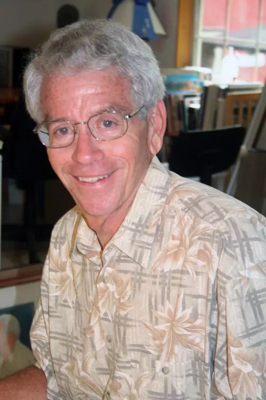
One of Dan Gerkin’s most avid readers was his brother, Jim, who just happened to be a WVU art student and the head student manager for the Mountaineer basketball team.
Gerkin grew up two hours west of Morgantown in New Martinsville, a small West Virginia river town along the Ohio, and had gotten to know Bowden and some of the athletic staff through his work with the basketball program.
“I was assistant manager for one year and head manager for three years, so I was involved with the athletic department,” Gerkin, now retired and living in Lancaster, Ohio, recalled recently. “There was a time near the end of that period, which would have been 1969 or 1970, when we kind of joined up the training table together with the football team at the Mountainlair. I was monitoring that for basketball, so I got to know the football team a little more so than I would have.”
Gerkin, whose last name is pronounced with a strong G, was always interested in sports. He once tried out for Steve Harrick’s Mountaineer baseball team and lasted until the final cut before catching on with basketball when new coach Bucky Waters was hired in the spring of 1965 and was seeking managers.
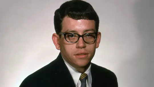
Then, when he became aware that Bowden was interested in changing the football uniforms, including a new helmet design, Gerkin immediately went to work.
“I had great interest in this,” he said. “I liked the idea of a new coach coming in, so I submitted some ideas – I think three or four different versions; I didn’t just send one, and being a graphic artist, I made them pretty nice. They weren’t just sketches, they were four-color and that sort of thing, so that may have helped.”
Gerkin recalls Bowden being pretty vague about what he wanted. The coach suggested using a football in the helmet decal with the University letters within the outline of the state.
It was imperative that the letters be W-V-U to appropriately identify the school as West Virginia University and not the University of West Virginia, a mistake still commonly made today. The color choices and the placement of lettering were strictly up to those submitting designs.
“I liked the idea of putting the state in there, too, because it’s a different and very unusual shape compared to the rest of the college football world,” Gerkin explained. “I even sent them some graphics of what I ended up seeing with the basketball floor, which was being designed at the time when the Coliseum was under construction.”
Gerkin sent the athletic department drawings of a basketball court with the state in the center, and MOUNTAINEERS off to the side because the end lines were always plain in the old Field House.
“There weren’t any fancy designs on the Field House floor,” he said.
Both designs were eventually adopted and used without much fanfare, according to Gerkin.
“After looking at the logo we have now, the Flying WV, I did have one that was a little more like that, but Bobby insisted on the U being in there, so it made it kind of too big and thick,” he mentioned. “Later, when the new one came along, I had one a little bit like that because I thought about having big, strong letters.
“I don’t know that mine was better, but if I criticize my own work now years later, I think the WVU was too small and too skinny to stand out like the big T in Tennessee,” Gerkin said. “I had one idea where they were bigger, but (Bowden) was also very much interested in the state and the football being in there, so you couldn’t cover it up if you tried to make the letters stronger. I liked those helmets across the country where the lettering was real strong.”
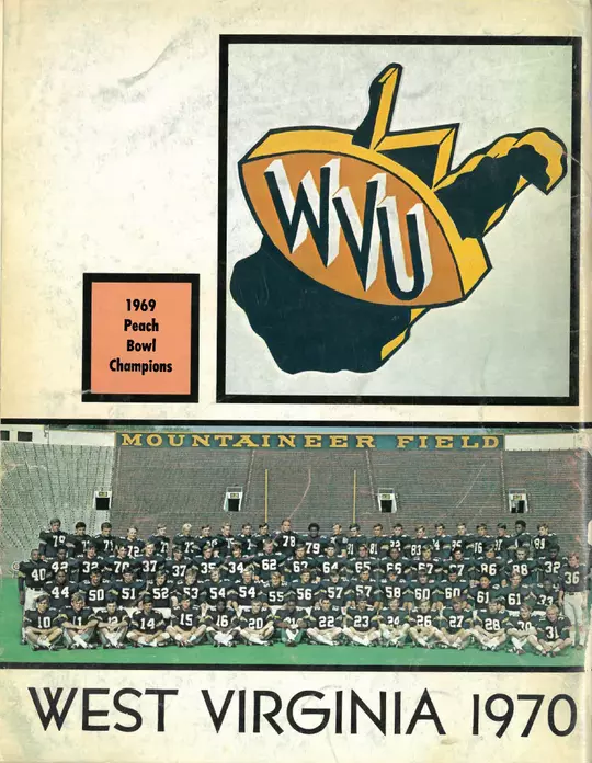
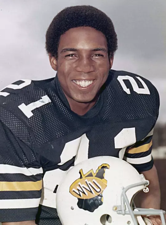
What was ultimately approved for the new white helmet in 1970 was a dark blue state of West Virginia, outlined in gold for a three-dimensional effect. Inside the state was an old gold football with blue letters W-V-U outlined in white, tilted in descending order. The football also had a bright yellow outline to provide additional 3D effect, which was strictly Gerkin’s doing.
“The three-dimensional design was the original as I prepared it,” Gerkin said. “Any modifications to it were made later and without any input from me, and that was always fine with me. I knew that as the years went by, there would likely be some modifications for various reasons such as special games and anniversaries.”
The helmet had a single blue stripe down the middle.
Gerkin doesn’t recall the specific timeline from start to finish, but he believes it was completed toward the end of the spring in 1970.
“Someone told me that coach Bowden was going to use my design,” Gerkin remembered. Gerkin didn’t know for sure his design was the one the team was using until he looked on the back of the 1970 football media guide and saw his logo above a picture of the football team next to the inscription, 1969 Peach Bowl Champions.
He didn’t receive a phone call, a handshake, or, more importantly, compensation for his efforts.
“I got kidded about that later,” Gerkin laughed.
Gerkin didn’t have much time to think about the helmet logo he designed or West Virginia’s new football uniforms because he was drafted into military service soon after, and was transported to South Vietnam, where he was stationed in a small hamlet serving as a Vietnamese language interpreter.
After completing his one-year tour of duty in 1971, he returned to Morgantown to earn his master’s degree in instructional design.
“When you are in Vietnam, one of the things you think about is getting married,” Gerkin explained. “So many of the kids over there were way younger than me, because I had already graduated from college, and I remember thinking, ‘If I ever get out of here, I’m going back home and getting married and starting a family.’ There were a lot of young guys over there who didn’t get to do that.”
Four days after returning from Vietnam, basketball coach Sonny Moran invited Gerkin to sit on the bench for a game played at the recently completed WVU Coliseum.
“The Coliseum wasn’t there when I left, so that was an awesome experience,” Gerkin admitted.
After earning his master’s degree, he began working for WVU in its mining extension department. He used his art degree to help design training brochures, which ultimately led to him landing a job with American Electric Power.
In the meantime, he married his wife, Sheryl, and they had two sons, Joshua and Matthew. Both sons were born in Morgantown before the family moved to Lancaster, where Jim and Sheryl still reside today.
They now have three grandchildren and one great grandchild.
Through some promotions and savvy investments, Gerkin was able to retire after 25 years at AEP to pursue full-time his first love – watercolor painting. He has since established a website, jim-gerkin.pixels.com, where his paintings are available for purchase.
His wife also has an Etsy Shop where more of his work resides.
“I’m a realist,” Gerkin said. “I am just stunned by what I see. You can make a bad day a little better if you are looking for art, because it’s everywhere. I will drive around and hit the brakes and say, ‘There’s a painting right over there!’ It could be in a place I’ve driven past 50 times, but at that particular moment, the way the sun is shining, or the mist goes off, it’s that amazing.”
A reunion of Bowden era players is taking place this weekend in conjunction with the TCU football game. Former Mountaineer linebacker Dave Benn has been to many of these get-togethers in the past with his old 1970 helmet that includes a green cross taped on the back in honor of the Marshall University football players, coaches, staff and community members who perished in the tragic plane crash that year.
The guys always enjoy gathering around Benn to take photos with him and the helmet that Gerkin designed.
Iterations of Gerkin's West Virginia football helmet logo lasted throughout the 1970s. The gold 3D outline was removed in 1971, and the helmet turned old gold in 1973. It remained that way until 1979, when the white helmet returned for one more season.
Then, in 1980, new football coach Don Nehlen wanted his own helmet and uniform design.
We already know that story!